
My first attempt at designing my geometrically themed creation myth tattoo went relatively well. This version is a little outdated, as I have since worked on it a few times, but I just wanted to document each step so that the progression of ideas and designs is explicit over time.
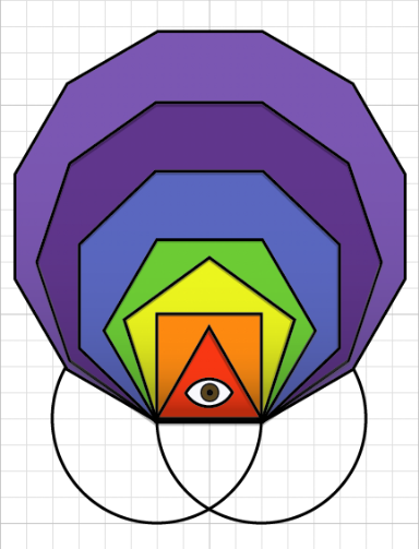
A few notes on the design. First, I have colored each of the seven polygons with a color from the spectrum we love to call ROY G BIV. This is symbolic of the diffraction of white light into the colors of the rainbow, which make the material world visible. These are vibrant colors, indicating a lively physical embodiment of abstractions.
The other obvious element I have included is the eye in the center of the triangle. This represents, at the base of the unfolding corporeal universe, an awareness that generates and sustains it. It is at the center of the design, and at the most basic level of the world of polygons. This is very much a nod to a favorite artist of mine, Alex Grey. Eyes of awareness are ubiquitous through his work. In fact, his work coupled with that of my good friend Michael Una, are perhaps the two most primary influences on this piece.
Compared to the original image that inspired this (see post below), a few things are different. For instance, I have included only two of the circles out of which the polygons emerge, and I have excluded the lines of projection. Using only two circles gives the image a little more economy, but it also leaves it a little unbalanced. Future designs will possibly bring these circles back in or leave them out again, as I experiment and decide which option seems to be the best overall embodiment of the theme.
Also, I have left out the projection lines, which leaves a little mystery in the relationship of the objects and the construction. My friend Heather would like to see the lines that determine the vertices incorporated somehow, perhaps implied through panels of color in each polygon, suggesting a stained glass window. I will experiment with this and compare results.
Also, my friend Matt would like to see some flames and perhaps some tentacles, to make it more awesome. These are ideas I will also play with.
Since I already have an even more up-to-date version of my design, I should have another post relatively soon.
And in response to Mr. Una’s comment on my first post – I’m not really sure when I will be able to afford getting inked, so I’m taking my time here. I will get an estimate so that I can project a timeline, though.

1 comment:
I am not sure if this color scheme is definitely part of the finished idea, but I wanted to bring up that rainbows have all sorts of cultural implications that are more readily read then the scientific.
Post a Comment